
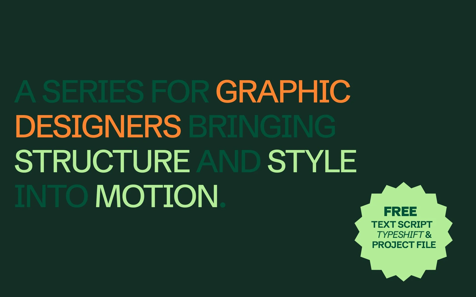
Typography in Motion: System Thinking for After Effects Designers
The design industry is changing fast.
What used to be a specialist craft, motion, is now part of the everyday language of brands.
Type moves, logos reveal, layouts breathe.
For many graphic designers, including myself, that shift can feel like a divide: design on one side, motion on the other.
But it doesn’t have to be.
The same logic that drives good design, hierarchy, rhythm, balance, clarity, is exactly what gives motion its meaning.
This series is for designers who want to cross that gap, for people who already understand systems, typography, and layout, and want to extend those instincts into motion.
It’s not about learning to keyframe for the sake of it, it’s about adding another bow to your creative arsenal.
Because brands now expect it.
They want designers who can not only define how things look, but how they move.

Typography in Motion: Bringing Design Hierarchy to Life
Typography gives structure to design, the rhythm that guides the eye and gives words their weight. It’s how we create order from information, clarity from noise, and emotion from shape and spacing.
In print or digital design, that rhythm is measured by spacing, the intervals between letters, lines, and paragraphs. In motion, those same principles apply, only now rhythm happens in time. Reveals, pauses, and transitions become part of the typographic system.
Think of each style as a tempo:
H1 arrives with presence, slower and more deliberate
H2 supports it, following just behind to guide the flow
Body text moves quickly, leading the eye through information
When reveal timing reflects hierarchy, motion starts to feel like design again, structured, intentional, and human.
But then we open After Effects.
Suddenly, the system disappears, and every headline becomes a one-off text layer. Every subtitle, a hand-styled duplicate. There are no paragraph styles, no global updates, no easy way to make the same change twice.
For designers moving into motion, it’s like stepping into organised chaos. You can feel the hierarchy slipping away, replaced by dozens of layers that all look the same until something breaks.
Why It Feels Broken
After Effects was built for animation, not design. It came from a world of keyframes, character rigs, and visual effects. But the rise of motion design blurred those lines, bringing a generation of designers who think in systems, typography, and layout into a tool that wasn’t made for them.
Despite its power, After Effects has changed surprisingly little in how it handles text and structure. You get incredible control over movement, but almost none over design logic.
Rebuilding Structure Inside Motion
The solution isn’t to fight the software, it’s to reintroduce the structure that design already gives us.
With After Effects theres lots of ways to achieve pretty much anything and lots of different use cases here are 3 basic Ways of Achieving this
Start by creating a comp called Typography_Styles.
Inside it, build your hierarchy just as you would in InDesign or Figma:
H1 for hero titles
H2 for section headers
Body for supporting text
Format each with your chosen fonts, sizes, and colours.
These become your master styles.
Now, in your working comps, link your text layers back to the master.
src = thisLayer.text.sourceText;

style = comp("Typography_Styles").layer("H1").text.sourceText.style;

style.setText(src);
Every time you adjust the font or tracking in the master comp, every linked layer updates instantly. It’s the same logic as paragraph styles in layout design, only now it lives in motion.
If you want it to work dynamically, replace “H1” with your layer name:
styleName = thisLayer.name;

src = thisLayer.text.sourceText;

style = comp("Typography_Styles").layer(styleName).text.sourceText.style;

style.setText(src);
Now any layer called “H1” or “Body” automatically inherits the correct style.
Linking Typography Without Inheriting Color When you need consistent font styling but varied colors (e.g., white text on dark backgrounds, colored accents), preserve each layer's color while inheriting typography:
var MASTER = "Typography_Styles";
var src = text.sourceText;

var style = comp(MASTER).layer(thisLayer.name).text.sourceText.style;
var out = style.setText(src);
try{ out = out.setFillColor(text.sourceText.style.fillColor); }catch(e){}
out;
Managing color across the project for layers, shapes text is another story again in After Effects we can achieve color management in a similar way, I will be looking at color over the next articles
Managing Text at Scale
Style is one side of the system, content is the other.
When you’re managing dozens of layers across multiple scenes, even small text changes can waste hours.
After Effects ships with a basic Find and Replace text but its very limited, We have created a complete text, font, and colour replacement toolkit for After Effects.
TypeShift gives you the power to find, replace, and refresh typography across entire projects in seconds without touching individual layers Sign Up to our newsletter at the end of this article for a project file and the Free Script
Managing type across the project
When the same lines appear in multiple scenes, manage them from one place.
Create a master copy comp, then reference its layers everywhere else.
Change it once, and every instance updates.
Setup
Make a comp called Text_Master
Add one text layer per reusable string, for example:
Introduction,Paragraph 01,Paragraph 02,CTA Primary,Legal,DisclaimerIn your working comps, place text layers where needed and link their Source Text to the master.
Name the target layer exactly the same as the master layer, for example both called Paragraph 01.
Source Text expression:
var key = thisLayer.name;
try{
  comp("Text_Master").layer(key).text.sourceText;
}catch(e){
  text.sourceText; // safe fallback if the key is missing
}
To combine it with a Text_Master copy workflow
You can just replace thisLayer.text.sourceText with your linked text reference, so it pulls the text from another comp instead of local content.
For example:
src = comp("Text_Master").layer(thisLayer.name).text.sourceText;
style = comp("Typography_Styles").layer("H1").text.sourceText.style;
style.setText(src);
This version allows:
The layer name to define which line of copy to pull (
Introduction,Paragraph 01, etc.).The style to be fixed (e.g. always
H1, orBody M, etc.).The entire text to update automatically when copy changes in
Text_Master.
We can go one step further with this and create a Dropdown expression driven Style Selector for your typography styles such as; H1s, H2s, Large Body etc..

3 Rigs in Project File
We have a free project file that gives 3 real world scenarios all rigged up with expressions Master Comps ready to use and try out.
Where Text Systems Save You
Wherever words appear more than once, systems protect you.
They save time, prevent errors, and keep your design intent consistent.
Campaign templates – one animation, twenty variations
Product explainers – prices, specs, and features that constantly change
Kinetic typography – dozens of phrases timed to audio
Social series – layouts reused weekly with new copy
Brand guidelines – repeated section titles like Logo, Colour, Typography
The bigger the project, the more essential it becomes to treat text as a single source of truth.
The Designer’s Advantage
Designers already understand the flow of a layout, the balance of space and weight.
The difference in motion is that time replaces the grid.
Spacing becomes pacing.
Once you recognise that, animation stops feeling technical.
You’re not keyframing, you’re composing.
And the hierarchies, grids, and tone you use in layout design translate directly into how things move.
That’s what makes designers such powerful motion thinkers, we already understand structure, we just need to express it over time.
Looking Ahead
In the next article, we’ll take this idea, structure expressed through time, and apply it to motion personality — how keyframes, rhythm, and easing can shape emotion.